Serta.com Redesign

A new Serta.com for a new DTC approach.

role
Co-lead Designer, Wireframing, UX/UI Design, User Research
In 2018, Serta Simmons Bedding (SSB) merged with Tuft & Needle (T&N) to combine their extensive manufacturing knowledge with T&N's customer-centric approach and experience in the direct-to-consumer (DTC) space. Our challenge was to redesign the site architecture, UX, and visual design of serta.com to simplify the eCommerce experience for customers and ultimately increase Serta's online sales. The project also had a tight timeline; five months from the Design Sprint to the site launch. Serta's extensive product line would be impossible to include at first launch with the given timeline, so we also had to coordinate with an external development agency to maintain a product catalog with all models that would not be available at launch.
Screenshot of existing Serta homepage.
The existing homepage. All teams agreed that the existing site was cluttered and difficult to navigate.

Sprint with Focus

We kicked off the project by sending a survey to the Serta Brand Team to understand the fundamental issues they were trying to solve with the site redesign beyond increasing revenue. After reviewing their responses and their customer segmentation research and existing site, it was clear that the redesign needed to radically simplify all aspects of the site. With a clearer understanding of the challenge, the Design & Content Teams brainstormed site architecture, navigation, homepage, and PDP strategies. We then developed those into wireframes in a three-day Design Sprint.

After the sprint, we continued to develop wireframes and content strategies for the entire site. Using insights and best practices from Tuft & Needle user research, we created modular designs that could be easily updated as Serta's DTC lineup expanded.
Two desktop wireframes of the navigation menu showing potential future states. In the first, two of the columns have an image with a label below, and the third column has descriptive text with two text links. In the second, all columns have an image with a label below it. Below the three columns, there is a section with two text links.
Each week, we presented our wireframes and facilitated discussions with the Serta Brand Team for feedback and design approval. We completed the wireframing stage three weeks early, allowing us a bit more time to focus on the new site's visual design.

A digital brand extension

We began our visual design stage by reviewing the existing Serta brand guidelines. The color and typographic palette were limited, creating several challenges for digital use. Working with the team, I began to develop an expanded type and color palette for the new site using their existing palette as a foundation. Knowing there would be a hesitancy to make changes to a globally recognized brand, I created a series of diagrams to clarify the purpose and usage across the site.

Typography

Serta's primary typeface, GT Walsheim, worked well with headlines, but its strong geometric form made it challenging to read when used in smaller, long-form body copy. After exploring several options, the team landed on Benton Sans. This taller and narrower typeface contrasted well with GT Walsheim and made the descriptive body copy throughout the site more legible for users.
Typography diagram showing headlines and body copy in GT Walsheim.
Typography diagram showing headlines in GT Walsheim and body copy in Benton Sans. The diagram is highlighted with a dashed red line.

Color

The existing palette consisted of several shades of blue with a single accent yellow. This limited palette made the current site feel monotonous and difficult for users to identify primary actions. The new palette introduced three new colors to the Serta brand, a light blue and warm neutral for background colors, and a deep red for primary CTAs. This expanded palette creates a better visual hierarchy on all pages and identifies essential elements for the user, creating a more intuitive experience.
Serta's color palette in circle swatches with three circles highlighted with a dashed red line.
Abstract diagram of a page layout showing Serta's new colors being used as section backgrounds and CTAs.

UI Kit

Once Serta approved the new palette, we developed a basic UI Kit using Tuft & Needle's kit as a roadmap. The UI Kit allowed us to move through comps quickly and was a valuable resource for the Development Agencies managing the external product catalog and blog.
Sketch artboards showing typography styles in Serta's new UI Kit.
Sketch artboards showing button and icon components in Serta's new UI Kit.

Design Development

We developed and presented final designs to the Serta team using the same weekly sprints as the wireframing stage. I was responsible for creating the Navigation, Footer, Homepage, About Page, and Product Catalog PDPs.

Navigation

As the site's primary goal was to drive DTC sales of the iComfort, we gave this product line greater hierarchy in the expanded mattress navigation. The links to the full Serta product catalog and retailers became secondary actions. The navigation's simple three-column grid allowed flexibility to update this hierarchy and include additional product lines over time.
Mobile comp of new Serta navigation.
Desktop comp of new Serta navigation. Two of the three columns are dedicated to the iComfort.

Homepage

At first launch, the homepage focused on the benefits of the iComfort series. The design included a series of simple, repeatable modules that simplified the UX of the site. All of the modules were placed into our CMS so that we could have the ability to update content quickly.
Serta's existing homepage hero featuring a couple and a CGI sheep laying in a bed floating in the clouds.

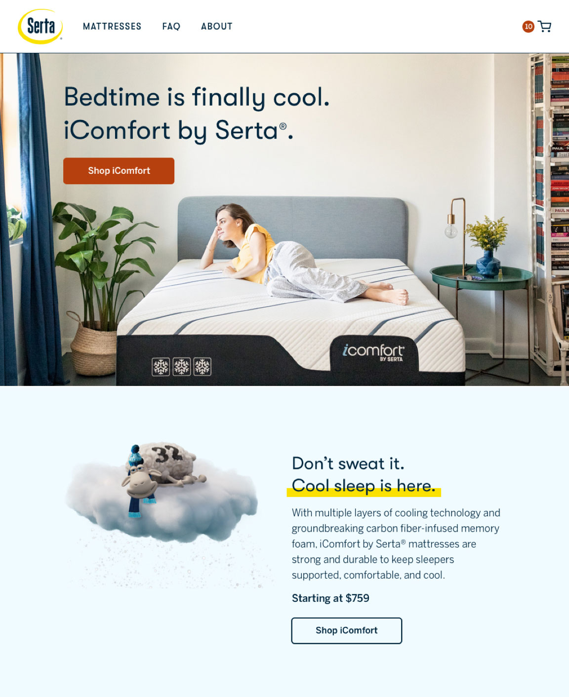
Previously, the homepage hero often used unrealistic settings, CGI sheep, and excessive typography. We learned from customer research and performance data that users preferred imagery that shows people interacting with products in a more realistic bedroom setting. The new homepage hero uses engaging lifestyle photography and straightforward typography to convey the comfort of the product. Sheep are decoupled from product photography and placed throughout the site to reinforce brand recognition and create visual breaks.

New Serta homepage hero featuring a woman laying on a bed inside of a bedroom. The section below the hero features an image of a sheep floating on a cloud on a blue background with descriptive text.

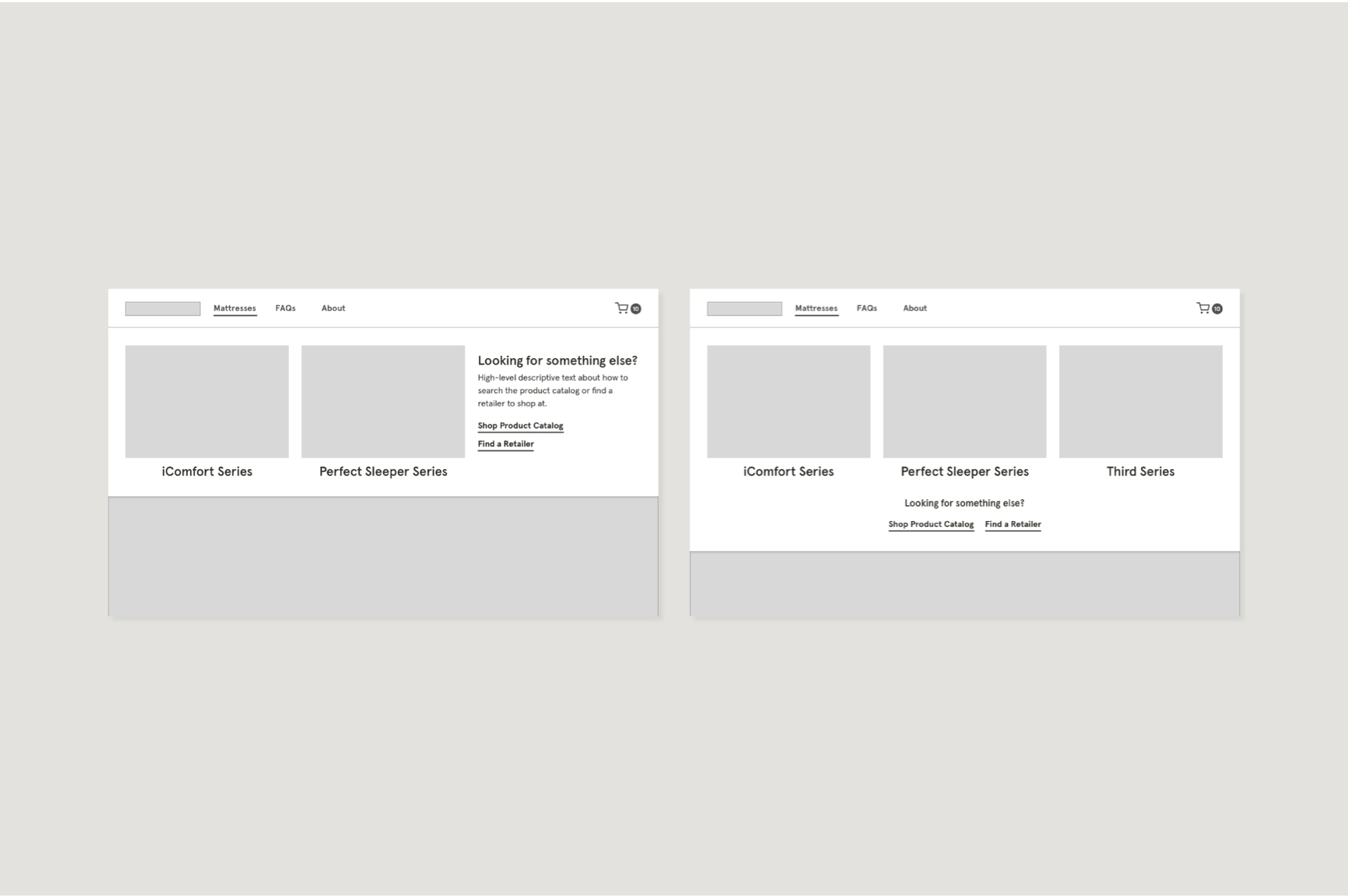
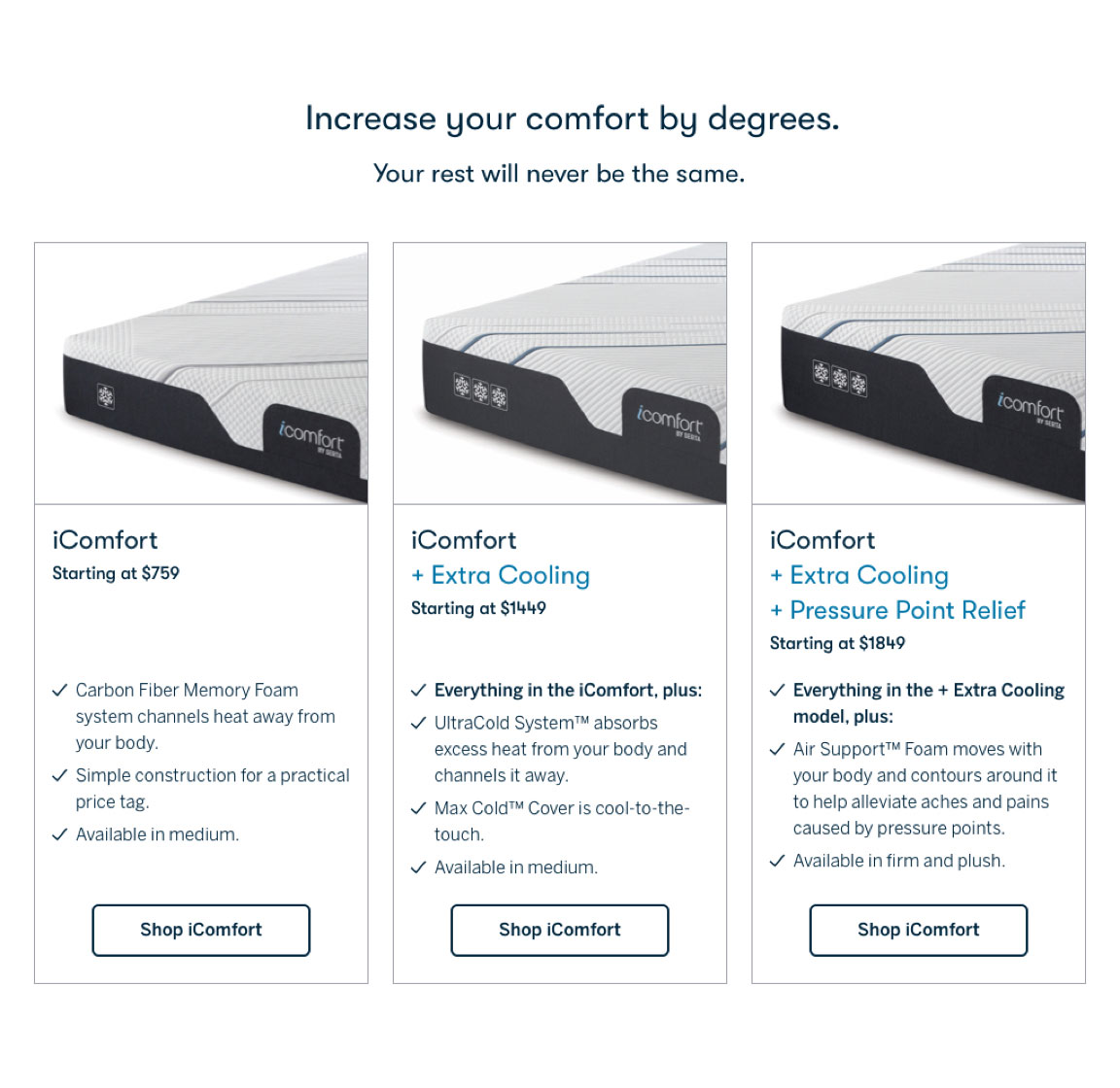
Clickable "cards" allow users to compare the benefits across the various upgrades of the iComfort. Each card directs the user to the product detail page (PDP) with the upgrade model pre-selected. When we launched additional mattress lines on the site, the cards were updated to reflect individual product lines.

Mattress compare section on new Serta homepage. Three cards each have an image of a mattress at the top of the card with details below.

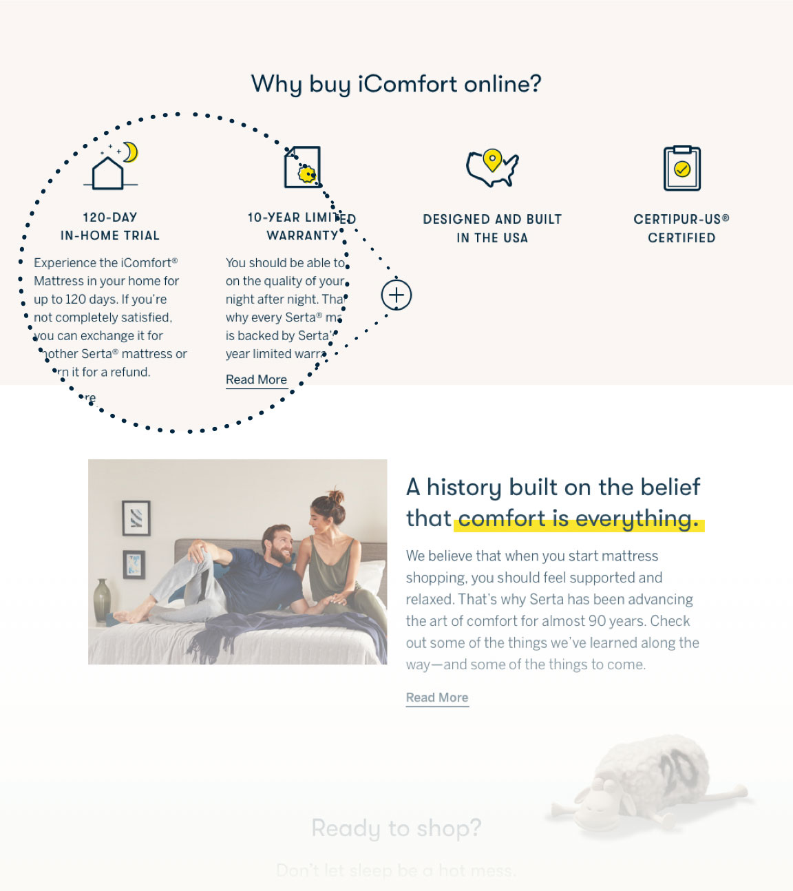
The expandable value props section uses custom iconography to introduce some of the DTC experience's unique benefits to users.

Value props section on new Serta homepage. Four custom icons with titles below and expandable content.